Volume 05: Type Justified
The visual language of cities and music
Each city has its own distinct style of unfurling before you. I forgot this.
It’s not just the web of avenues radiating out from the center, but the specific configuration of you, the season in your life, the shapes and the shadows of your thoughts, and what you seek as you move through its spaces. The liminality of visiting and the transience of being factor in who you are in this moment, and the city opens up, accordingly, pulling you closer to the details. It’s an emotional mapping that emerges in quiet moments staring out of a train window, from the spice you can’t name on the tip of your fork, on the dance floor with the bass that vibrates through your sternum, amplifying the waves of your heartbeat. I forgot this. It had been a long time since I wandered around a new city, a long time since I had felt as wide-eyed and present as I did in Berlin.

Pandemic and political firestorms aside, a lot has happened since my last trip abroad just in my own life. A little over four years ago, I completed two design programs (one for graphic design and one for user experience), quit my job, and decided to commit to a creative career path that pursued design, art, and writing. (Quick recap: rough times! Self-doubt in spades! Loads of rejection! No regrets!) My new life centered creativity in a way that felt squirmy and vulnerable at first, but I slowly grew within the discomfort of transition, treading the choppy, open waters of freelancing. My brain felt different, more primed for and practiced in making connections across disparate concepts. I loved what I got to think about in this work—branding small businesses, writing newsletters about food, interviewing people, wireframing websites, all across different fields. To borrow Ellen Lupton’s phrase, “design is storytelling,” and the best examples of it rely on empathy to move you and solve your problems. The experience should be emotional, functional, accessible, and delightful. On my trip last month, I realized I was experiencing Berlin in a way I wouldn’t have a few years ago, before choosing a life of creative chaos.
There’s a design sense in Berlin that gives it a certain character of motley aesthetics, underscoring the tensions between its past and future. You see it in its architecture, from its remaining Gothic cathedrals to its Soviet-styled landmarks, from crumbling remnants of the Berlin Wall to its sturdy Brutalist structures and balanced Bauhaus shapes—all stitched together by layers of scrawling graffiti. Perhaps more subtly, the words of the city do this as well, reinforcing its history from the stylized versions of German Blackletter to the proliferation of minimal and modernist sans-serif fonts.
The typography in Berlin made an impression on me. I took many pictures of signage, billboards, awnings, bus stop advertisements, menus, packaging, and posters.
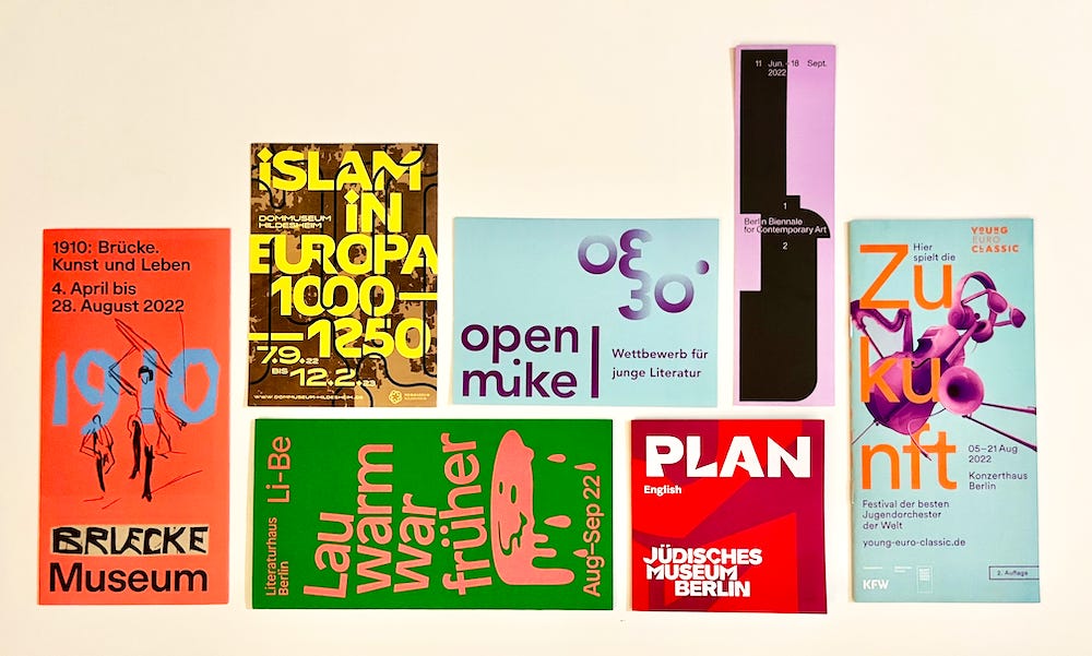
I wanted to rip off flyers pasted on plywood to frame in my apartment. I came back with a carry-on full of museum brochures, art publications, postcards, prints, an exhibition catalog, and bars of chocolate with rad branding as souvenirs.
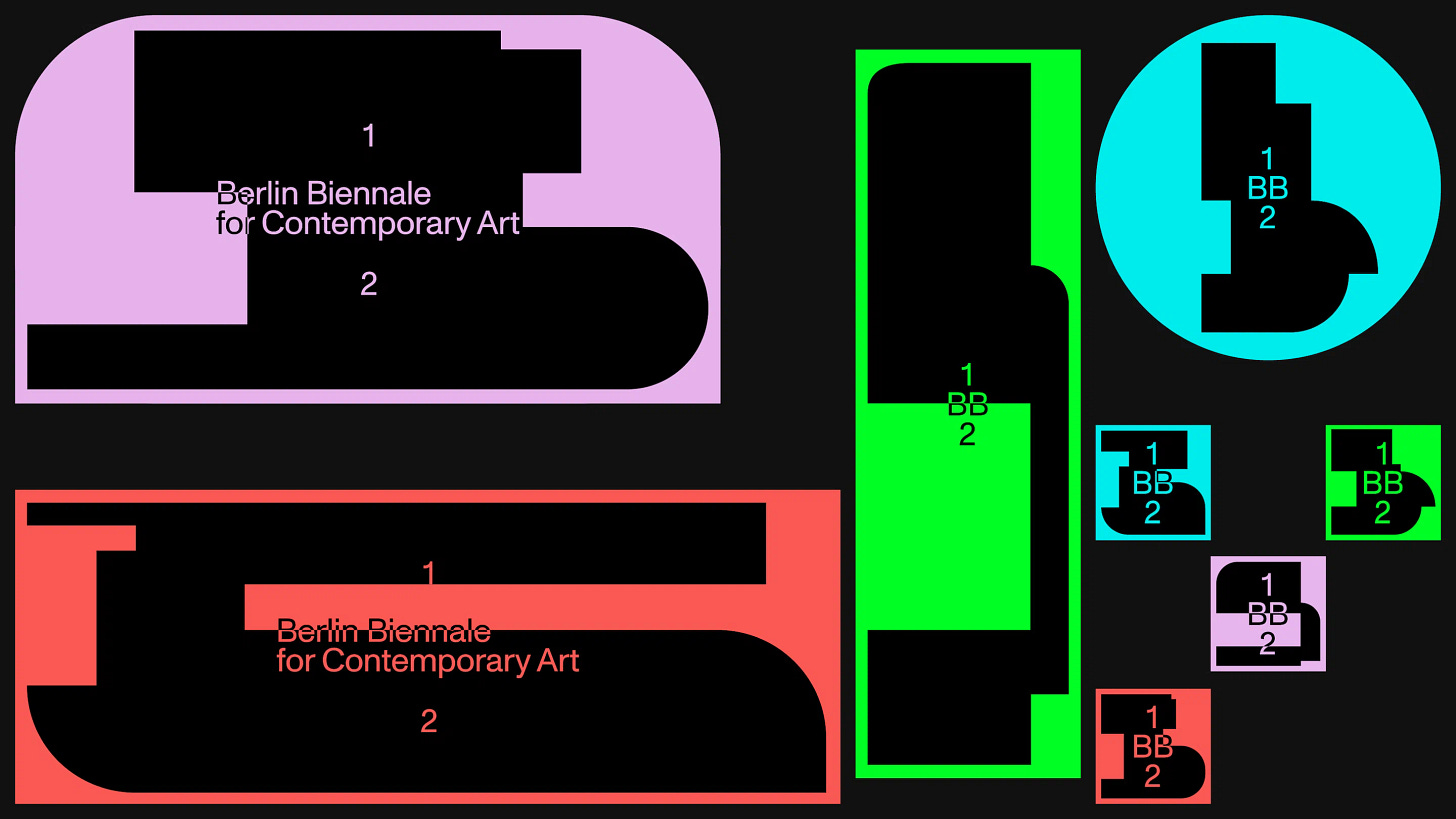
The Berlin Biennale in particular, featured an awesome design system with signs that unified all of the museum sites across the city, making it feel especially auspicious that we were there at that time. Berlin is a city that cares about its layouts and lettering, it understands how to lure you in with visual information. It makes sense, Germany gave us Johannes Gutenberg, the mind behind the first printing/information revolution in Europe, so there is a typographic legacy to uphold.

I love typography because there are so many ways you can nerd out and obsess. If you are detailed and persnickety, you can drill down into typesetting—kerning, leading, tracking, rivers, widows, orphans, glyph scaling, hyphenation, hanging quotations—so many rules but there’s an art to the eyeballing. If you love systems, then type designing opens you to the world of typeface families, sizes, line weights, shapes, expressive strokes, ligatures, legibility, digital hinting, and printing functionality. If you’re prone to archiving, then studying the categories and subcategories of serif and sans-serif typefaces becomes a nuanced game of type anatomy—bowls, ears, x-heights, counters, ascenders, descenders, terminals, eyes, and tails, to name a few parts. If you love the OG hardware, the analog process, then get your hands dirty with all the ways you can print, from woodcut to letterpress. You can even cast and engrave the individual metal type matrices yourself in a foundry.
And then, dear reader, there is the lush history of typography. It’s completely bonkers to me, that a stylized letter system that was first created by chiseling into stone is still read and written centuries later by typing corresponding buttons on a screen. The Old Style serif typeface Garamond, for example, was created in the 16th Century, by a French type publisher named Claude Garamond, who originally designed it for Greek and Latin texts. Now it's used for the U.S. editions of Harry Potter and The Hunger Games—a font consistently called upon for the bestsellers of its time! Imagine designing something so beloved, beautiful, legible, and ink-efficient that people (and companies like Adobe) centuries in the future would transfer it into technologies you couldn't even conceive or comprehend. And that’s just Roman letters! Think about all the fonts designed for languages you can’t read. Typographical design is as aesthetic as it is functional. Design history is almost always taught separately from art history, but it’s just as telling of the society and culture that created it—perhaps it even reveals more.

For Volume 05’s theme, I want us to think about typography and how it communicates beyond the meaning of the words themselves. For the next month, let’s consider the associations and histories of text and type within the visual language of contemporary album covers.
Volume 05: Type Justified
How did the same kind of typeface used to print Gutenberg’s Bible become synonymous with L.A. gangsta rap in the 90s, and later, in Taylor Swift’s Reputation rebrand, in 2017? How does the font Cooper Black convey nostalgia the way Frank Ocean intended when he was channeling orange? Rihanna became one of the few recording artists to put braille on an album cover when she partnered with painter Roy Nachum for ANTI’s artwork in 2015. How does reading accessibility affect the way we connect to art and information? And lastly, can we consider emojis as an illustrative language similarly to other pictorial letterforms? Maybe Certified Lover Boy Drake and Damien Hirst can tell us more.
Thanks for reading. Any type nerds out there? Tell me your favorite font below!


Oh my! This is my favorite by far topic. Text as Image. The history of Bauhaus. The legacy of the 1972 Munich Olympic Games (check out that design system). What wonderful lists you gathered, so wonderfully generous and interesting to read. I read the middle paragraph out loud, pure design poetry :)
Oof, literally my ~favorite~ art / design topic. SO good. Did you happen to visit the Buchstaben Museum while you were in Berlin? Small, but very cool! And to answer your question - I'm a big fan of juicy, swirly typeface a la 70s flower-power-peace-and-love album covers. Thank you for sharing the Garamond deep dive!