For the last 6 years, the Rihanna Navy has been feeding on the crumbs of rumors and TMZ footage of her leaving studios, awaiting a whisper for her next album to drop. The fandom had nearly abandoned all hope, when just last month she announced her headliner gig at the 2023 Super Bowl Halftime Show, as a ‘don’t call it a comeback’ kind of return. Two weeks ago, she released a new song “Lift Me Up,” a melancholy ballad, as part of Marvel’s Black Panther: Wakanda Forever soundtrack. Will next year be a very RIRI 2023? Will we finally get that new album #R9? In anticipation for her imminent reconquering of the charts, we’re revisiting her last album from 2016, ANTI, and the art behind it.
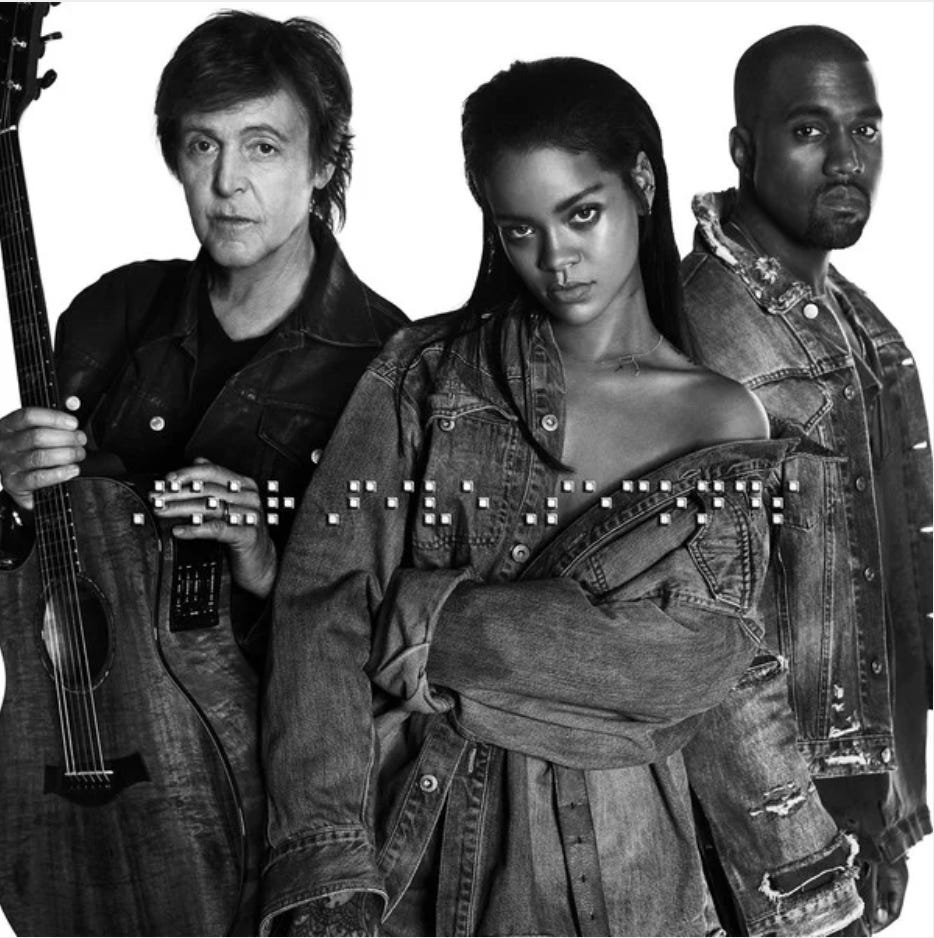
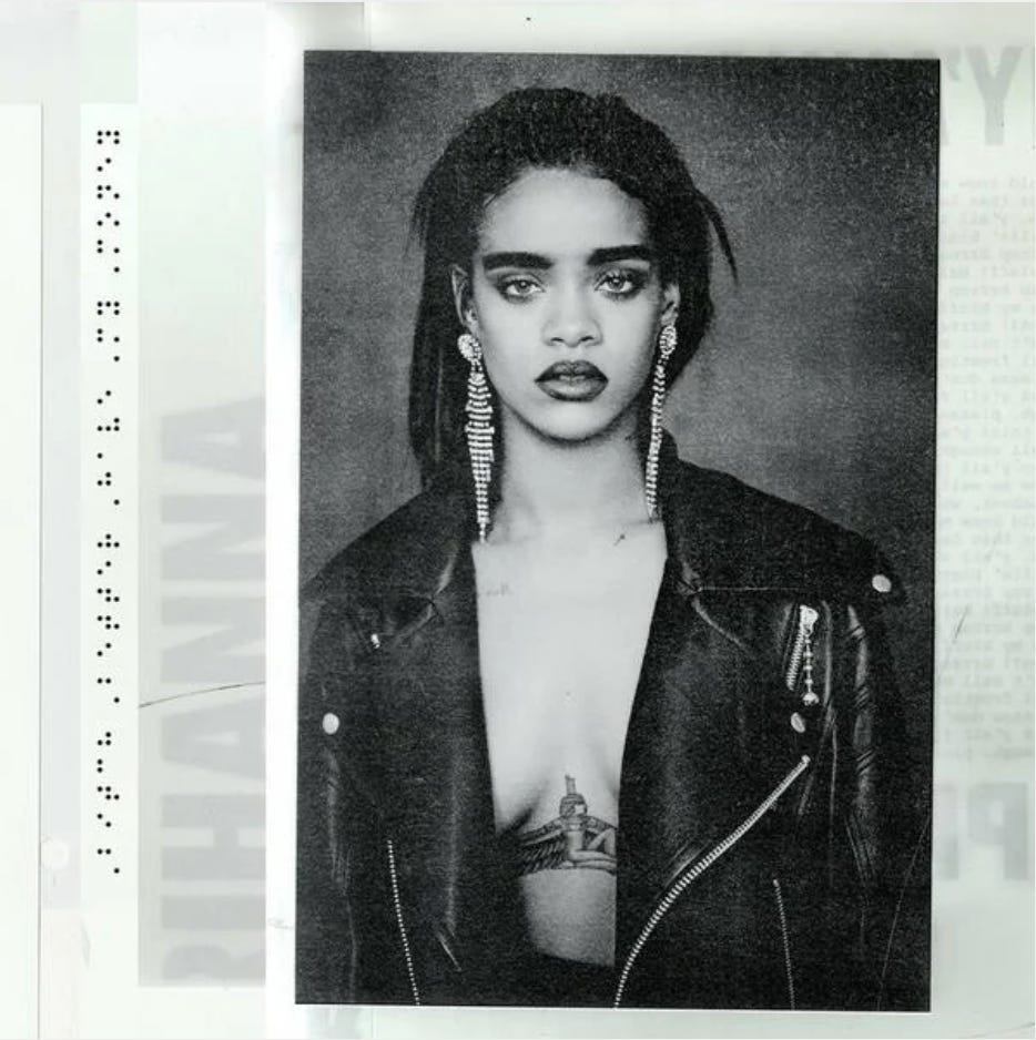
Before Rihanna dropped ANTI, she released 3 non-album singles, “FourFiveSeconds,” “Bitch Better Have My Money,” and “American Oxygen” in 2015. Neither flops nor hits, they pushed her sound towards more experimentation than her previous songs, priming us for ANTI, her most critically acclaimed and arguably* best work of her career to date. (*Fenty Beauty’s Moroccan Spice Palette from 2018—a close second.) Stylistically different in sound and videos, the only unifying theme between the 3 singles was their cover art, all designed by artist Roy Nachum. They featured black and white portraits of Rihanna (and her collaborators) with braille as the main text. I remember seeing these images in 2015 and wondering why I had never seen braille on an album cover before. Why did this feel so groundbreaking?
Track 21 considers the non-visual ways we can experience visual art. Braille on beats. Accessibility, baby!
*A note from the author: I’ll address Ye (Kanye West) and recent problematic behavior at the end of this essay.
Rihanna dropped ANTI in January 2016, but a few months before, she announced the album artwork on October 7, 2015 as part of a small, invite-only exhibition at MAMA Gallery in Los Angeles. The show featured 7 paintings she commissioned from Roy Nachum, all tied to the concept and visuals of her album. Upon arriving, guests received a red blindfold, which they were encouraged to wear while exploring the tactile aspects of Nachum’s braille paintings. He presented 3 white monochrome paintings of his poetry, set in wood frames that were burned to the point of becoming charcoal. Without their sight, people touched the frames and canvases, leaving smudged handprints from the charcoal’s black reside, ultimately adding new visual and conceptual elements born from the collaborative experience.
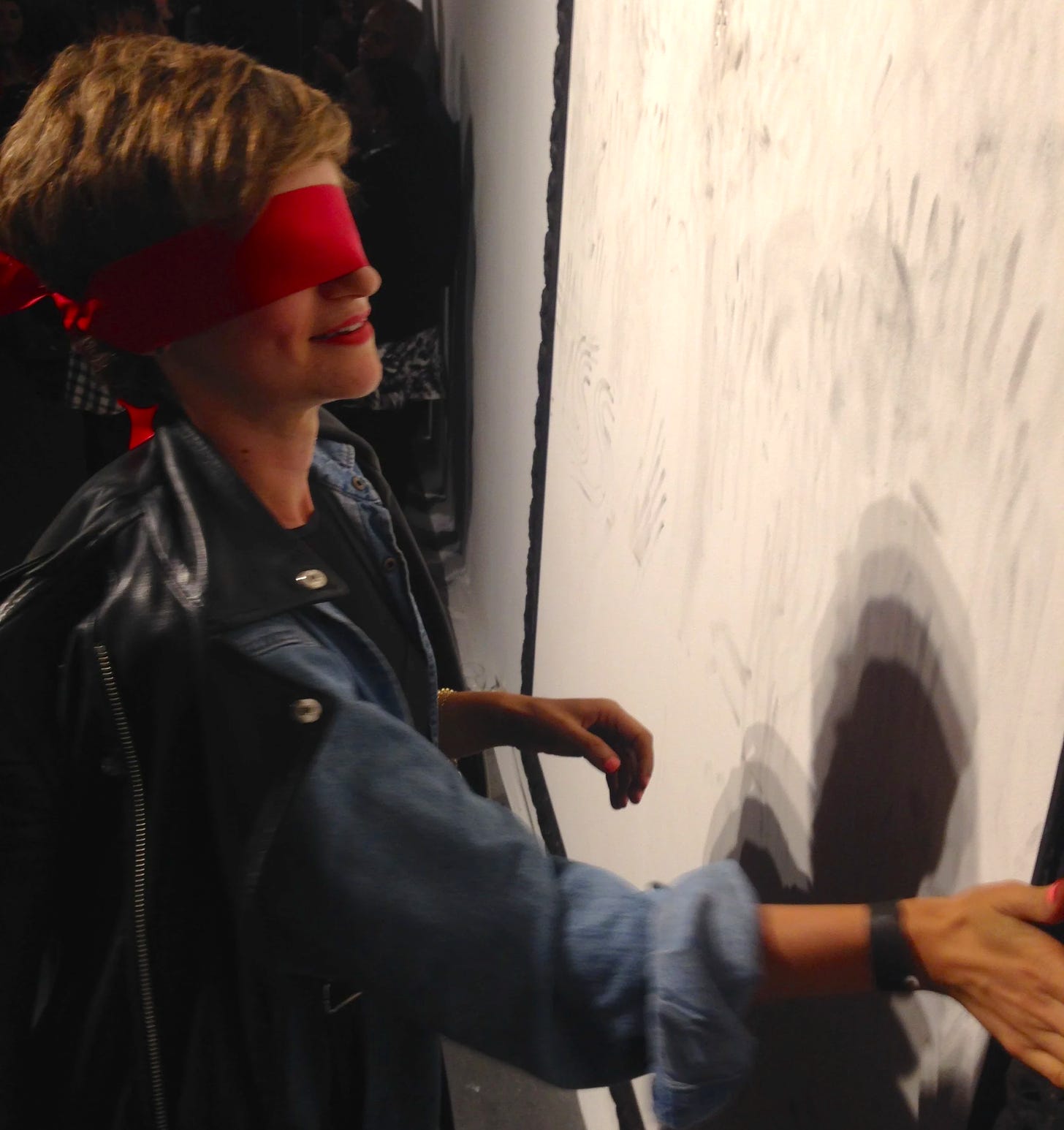
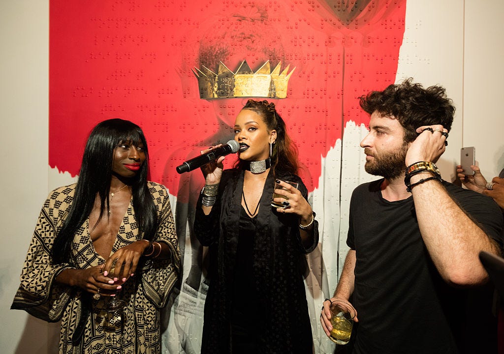
When Rihanna unveiled Nachum’s painting for the ANTI cover, she explained the meaning behind the braille as, “Sometimes the ones who have sight are the blindest.”
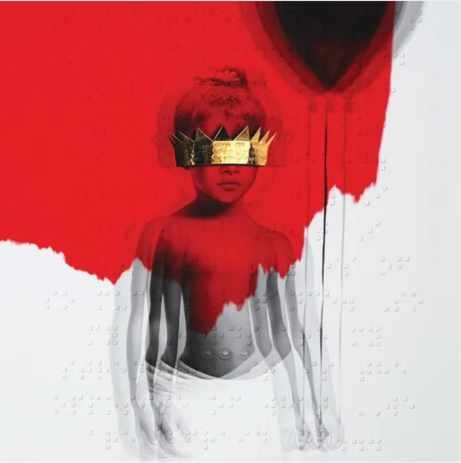
In her speech to the gallery crowd, Rihanna revealed that the painting was inspired by a photo taken on her first day of daycare. (You can watch the full speech here.) The image shows Baby Rihanna holding a balloon and wearing a gold crown, also embossed with braille, over her eyes so that it obscures her face. This gold crown is a trademark in Nachum’s oeuvre. Like the previous 3 single covers, Nachum depicts the portrait in black and white, except for a large, cadmium red swathe of paint that covers half of the composition. As part of his signature style, Nachum creates a double exposure effect, layering the figure with echoed outlines. The art for ANTI pushed the use of braille further by incorporating poetry set in the writing system as overlay on the paintings and throughout the physical album packaging. (If you’re curious, here is an unboxing video for the CD.)
In an interview with MTV, Nachum describes the meaning in his own words:
…I painted a young Rihanna over the canvas. There's the balloon that's lighter than air. It's kind of a metaphor of escaping reality. You have the gold crown covering the eyes, symbolizing the success of people, and how sometimes people forget to appreciate the small things in life. Just going and going and going. When you see the braille on top of that, it's also a metaphor, to open people's eyes — to stop for one moment and try to appreciate the real simple things in life. That was the goal. In terms of the music, I chose the red color because it's very bright and dramatic, and that symbolizes the music. You have something very innocent —a young girl— and then you have that red.
Chloe Mitchell’s poem, “If They Let Us,” appears on the painting and on the front and back covers of the CD and vinyl packaging. From braille it’s translated as:
I sometimes fear that I am misunderstood.
It is simply because what I want to say,
what I need to say, won’t be heard.
Heard in a way I so rightfully deserve
What I choose to say is of so much substance
That people just won’t understand the depth of my message.
So my voice is not my weakness,
It is the opposite of what others are afraid of.
My voice is my suit and armor,
My shield, and all that I am.
I will comfortably breathe in it, until I find the moment to be silent.
I live loudly in my mind, so many hours of the day.
The world is pin drop sound compared to the boom
That thumps and bumps against the walls of my cranium.
I live it and love it and despise it and I am entrapped in it.
So being misunderstood, I am not offended by the gesture, but honored.
If they let us...
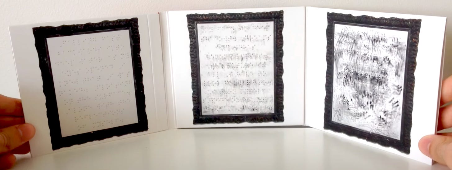
The album packaging opens to the 3 braille paintings of poems written by Nachum. These represent the paintings guests touched at the gallery show, and include the smudged handprints. For the full translations of these poems, Fire Part I, II, and III, check out this Pitchfork article.
For many, including myself, Rihanna’s album art introduced Roy Nachum to a larger audience. I especially loved learning how he considers accessibility, inclusion, and participation when creating. His inspiration first came from encountering braille signage at a museum. From that point, Nachum wanted to explore the possibilities of how visually-impaired people could experience visual art.
“My hope is to strike a variety of emotional chords with blind readers/viewers that is similar, but not identical to what different people with sight take away from a painting. I wanted to test our reliance on what we see and force different viewers to re-orient their perception of a work by also employing their sense of touch. Our visual sense is far more complex than we realize. Memory and imagination play a major part in our interpretation of what is actually in front of us…”
The concept around ANTI’s artwork came from Nachum’s series “Fire and Ash,” which he showed Rihanna as they collaborated on ideas for her album. She touched his paintings without sight, as she listened to her own music. They then replicated this experience at the gallery opening. He explains the process further via his website:
“Fire Paintings utilize Braille Poetry and Ash, Braille is sculpted onto canvas and wood frames are burned until charcoal. The paintings are executed with the participation of people who are blind, leaving fingerprints as documentation of human contact. Nachum employs the system of raised Braille cells sculpting them in rectangular columns across the canvas. As collaborators run their fingers from the frame to Braille, evidence of human interaction remains on the canvas. Nachum encourages people to continue to touch and interact with the work, breaking the barrier between viewer and “sacred object.” After repeated contact the work evolves and remains always alive. The interaction adds an element of performance; the artist starts a painting and leaves the viewer to complete it.”

To fully immerse himself when making this series, Nachum lived blindfolded for seven consecutive days, where he experienced “vivid and intense visual hallucinations and periods of complete and total darkness where he felt detached from the physical world…It provided him with a deeper understanding of his non-visual senses, and challenged him to offer a way into his work for people who otherwise may never “experience” a painting.”
How do we build empathy through art? In spring 2021, I created a lesson around accessibility for the high school graphic design class I taught. I assigned my students to read the first chapter of Mismatch: How Inclusion Shapes Design by Kat Holmes. In it, Holmes poses this question: “What happens when a designed object rejects us?” and further elaborates:
“A door that won’t open, A transit system that won’t service our neighborhood. A computer mouse that doesn’t work for people who are left-handed. A touch screen payment system at a grocery store that only works for people who read English phrases, have 20/20 vision… When we’re excluded by these designs, how does it shape our sense of belonging in the world?”
She drives it home with this: “Ask a hundred people what inclusion means and you’ll get a hundred different answers. Ask them what it means to be excluded and the answer will be uniformly clear: It's when you’re left out.” I asked my students to come up with an example from their own lives when they interacted with something that wasn’t designed for them. I then asked, "How did it make you feel?” It’s an exercise I keep in mind when I’m designing for others as well. But what about when I make art for myself? Art as self-expression only needs to satisfy the creator, but what about art made to satisfy a massive fanbase, brand, multi-faceted business, and recording contract? What is the responsibility for artists to create more accessible art and experiences on that scale?
Accessibility is a core tenant of human-centered design, but when we think about accessibility in art, it generally refers to the relationship the audience feels with the content itself rather than the actual logistics of access. Visual art takes the form of objects—even digital pieces require some kind of hardware. ANTI as music, as a gallery exhibit of tactile braille paintings of poetry, and as CD/vinyl packaging with both English text and braille multiply the possibilities for experiencing the music across the visual ability spectrum. Conceptually, the braille serves as a metaphor for sight not equating to a singular truth or reality—acknowledging other ways of ‘seeing,’ as means of understanding. This project made me consider the visual components around popular music—the photography, music videos, choreography, fashion and styling, social media campaigns, and the spectacle of concerts. These elements intended to enhance the music, now build immersive worlds around it. Yes, Rihanna did that all for ANTI, but she also included touch and into the sonic and visual experience of the project, and opened the world to more fans through an additional system of communication.
Only a few other recording artists have incorporated braille into their packaging. Kendrick Lamar’s To Pimp a Butterfly, for example, printed braille hidden inside of the album pamphlet, which he revealed as the full title of the album. In an interview with Mass Appeal he explained:
“[There]’s actually a sketch of Braille that’s added to the title hidden inside the [CD] booklet that I don’t think nobody has caught yet. You can actually feel the bump lines. But if you can see it, which is the irony of it, you can break down the actual full title of the album.”
According to this Independent article, the braille reads “SINCERELY” on one page and “A BLANK LETTER BY KENDRICK LAMAR” on another. But when Complex fact checked it with Alison Hawes, a teacher of the visually impaired, they discovered it actually translates to “A KENDRICK BY LETTER BLANK LAMAR.” Sometimes the concept gets sabotaged by the execution.
No pun intended here, but I’m left thinking about how artists—especially those at the superstar level of Rihanna and Kendrick Lamar—make their fans feel ‘seen.’ The strength of our connection to art multiplies when we have diverse means of access to it. This happens when musicians greet their crowds in their own languages, when they provide therapy services to fans as part of their tour, when sign language translators rock out next to the stage, when album packaging has braille on the cover. Yes, please hire fact checkers—but, there will always be some hiccups in communication, wonky translations, gaps within cultural nuance, and misinterpretations. The point is to try. And when mistakes inevitably occur, to correct them with speed, grace, and respect, learning from the process to do better next time.
As an endnote, I really enjoy exploring ideas about accessibility within art and how artists create connections through different means of communication. It’s what inspired my favorite lessons as a teacher; it’s what makes me tick as a designer. But within that, we have to acknowledge how artists can impact the relationships created through their art with their problematic actions outside of it. And now…
*A note from the author: I included the cover art to “FourFiveSeconds,” which features a photo of Ye (Kanye West), alongside Paul McCartney and Rihanna, who all sing on this track. In light of Ye’s antisemitic remarks, I want to state clearly that I’m not condoning or ignoring his problematic actions by including this photo. My intention here was to show the art of Roy Nachum, an NY-based Israeli artist, whose work promotes empathy and inclusivity across cultures and ability spectrums. I wanted to include this cover art alongside the other braille pieces referenced in this essay to create a fuller picture of his oeuvre. Additionally, after writing this essay, I learned that Johnny Depp walked in Rihanna’s Savage X Fenty Show Vol. 4, which left me...confused among other things. And since I wrote about Drake recently, I found his hostile lyrics in Her Loss accusing (without mentioning names) Megan Thee Stallion of lying about who shot her (what??!!) pretty upsetting. It turned me off from listening further. (Read more about the Fenty Show via Vanity Fair here. Read more about Drake via The Atlantic here.)
We’re experiencing these controversies play out now in real time to varying extremes. We’re no strangers to this happening, and they will continue. But what are the best practices to address them? And how do we renegotiate our relationship to the art when we disagree with the artist’s choices and behaviors? I think about this a lot (A LOT) and I’d like to explore that more in a future essay, but I hope this suffices for now.
This is the final track to Volume 05: Type Justified. (I took my sweet time!) Thank you for nerding out about typography and text with me over the last few months. I’m looking forward to switching things up a bit as we wrap up the year.
As always, thanks for reading.



There is so much here to make the brain explode, what a rich post.
That elegant definition of inclusion/exclusion and your ending appeal for the importance of trying is so to the point, and I appreciate that. For whatever reason, organizations that talk about these things tie themselves up in knots with frameworks and mission statements and blah blah, when they could be, as you say, just trying in good faith and adjusting when mistakes are made. Like any other creative process. Great essay.
As always such interesting reading and a really important topic. It has made me think about inclusion in the visual arts. I might also write something about it. Thanks for the inspiration!