Field Trip!
Dive into the archives at The Herb Lubalin Study Center with me.
Forgive the skip last week! It’s been a packed month with work and I’m living the D.R.E.A.M. right now—Deadlines. Rule. Everything. Around. Me. But we’re back!
I’m excited to switch things up a bit because dear reader…
WE’RE GOING ON A FIELD TRIP.
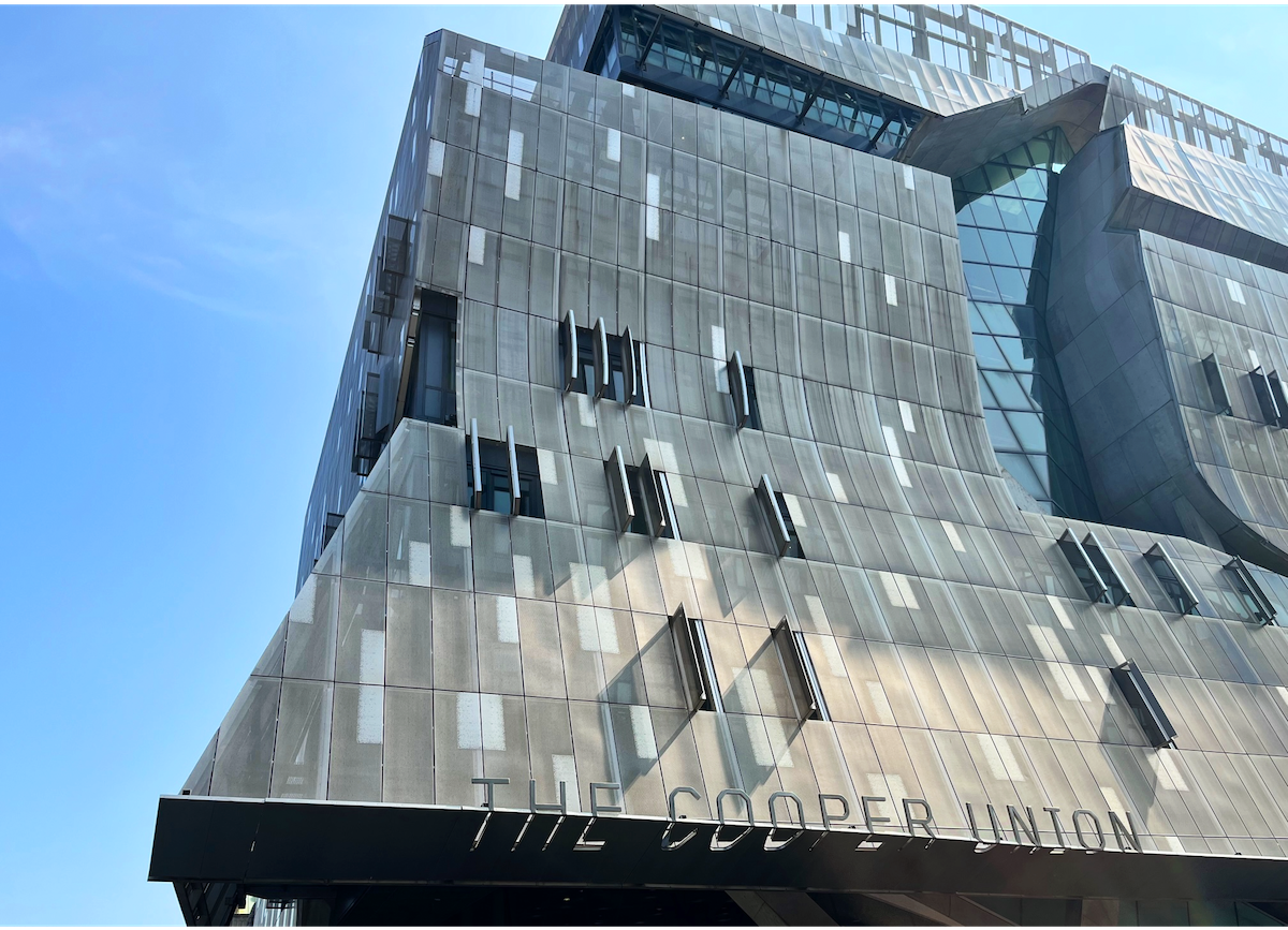
I am fresh off a visit to The Herb Lubalin Study Center of Design and Typography, located at The Cooper Union in New York City. Founded in 1985, the Lubalin Study Center is a small but mighty, ever-expanding archive of printed typography—from books and magazines, to original art posters, maps, hand-lettered logos, signs, and product packaging. The collection holds over 70,000 pieces spanning over 125 years and across 5 continents. It’s completely free but by appointment only, and I felt fortunate to snag a las-minute slot when I called to see if they could squeeze me in before they closed last Friday.
When I arrived, I met the Lubalin Center’s curator, Sasha Tochilovsky, who was kind enough to give me a tour of the space and the rundown on how they organize the collection, the archive’s history, and the vision for its future. (If you tell him that you’re interested in something particular, he can pinpoint the nondescript box or drawer that reveals exactly what you need. Magic.) The archives display revolving piles of rare and awesome design books from their extensive shelves; wide metal cabinets line the walls, each labeled by designer, time period, theme, or region. The act of pulling each drawer feels like opening a window into a surprising and delightful micro-collection of culture, aesthetics, and ideas. Visitors can gently remove these materials to further examine and photograph them. There were so many stacks of design pieces I had never seen before, and also a few familiar files that I first encountered as images in design books.
One piece in particular, came from one of Herb Lubalin’s drawers. See the logo on the right in the photo below—I used this example in one of my design classes last year to illustrate relationships between text, space, meaning, and visual puns. I was so excited to actually hold it and to read the draft notes in the top right corner.

Herb Lubalin (1918-1981) was an alumnus of Cooper Union who became a prolific type and graphic designer, most known for his magazine work. In collaboration with publisher Ralph Ginzberg, they produced three magazines, Eros, Avant Garde, and Fact, in the 1960s and 70s. He also co-founded the International Typeface Corporation in 1970, which also published U&lc Magazine. (U&lc is shorthand for upper and lowercase.) Previous to this, I had only seen this magazine digitally scanned on the internet, so imagine my thrill of getting to thumb through a copy from 1981. (You can view digitized copies on blog.fonts.com if you’re curious.)

On the tables in the front room, Sasha described how they present parts of their collection—not by famous designers, or prestigious studios but by what looks interesting and intriguing. They aim to appeal to all kinds of visitors and students, so why not feature more unique, obscure pieces? Accessibility is a core tenant to the center and speaks to the founding values of Cooper Union as an educational institution and its tuition-free history from 1859-2012. (They are aiming to go back to a tuition-free model by 2029.)
When I spoke with Sasha, he further explained their mission of accessibility:
“We try to maintain that idea [of accessibility] because the accessibility to material is essential. There should be no barriers, and digital technology as democratic as it is, still has a lot of barriers for people. There are gatekeepers within that space too, in the way that algorithms are written. There are no limits here, and what we try to do is be as physically accessible to our visitors. It’s also important for us to know as much as we can about these things so we can make connections for them. When they ask us if we have something they’re looking for, we can provide that and give the additional context, because the work itself hides a lot of stuff. What you see as the final object is almost misleading—the way something looks doesn’t reveal how it’s made. The important thing for us is to lift that page, to really unpack it so that there’s an understanding of why this exists. Why is this important? Why have we forgotten the importance of this? That’s our mission—to give as much as we can to the materials.
People made this work—they aren’t anonymous, they have a name, a history. The work is part of them. If we have their work, we have to know who they are, especially on a paperback, or when there are no credits on the box. Knowing who made it opens up such a great world. We can find out who they were, what their motivations were, what their life history was, which is often complicated and contradictory. It helps make the work feel more human.”

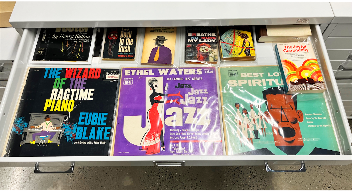
In March 2022, the Lubalin Study Center of Design and Typography announced a gift from graphic designer, writer, and entrepreneur, Cheryl D. Miller, to “establish a collection dedicated to the work of Black graphic designers.” In 1984, she established Cheryl D. Miller Design Inc., as one of the first design firms founded and led by a Black woman. Her portfolio includes an extensive client list from NASA to Chase to Sports Illustrated. As the Lubalin Center continues to prioritize its expansion, you can view the foundational pieces of The Cheryl D. Miller Collection of Black Graphic Design History, which features design work from other Black designers and illustrators: Mozelle Thompson, Reynold Ruffins, Loring Eutemey, Verdun P. Cook, and Roy E. LaGrone. Stanford University Library’s Special Collections also holds The Cheryl D. Miller collection, from her personal archives, which “documents Miller’s research and advocacy work related to racial, cultural and gender equity, diversity and inclusion.”
The range of work found within this collection centers on how these Black designers (and many others with drawers yet to be filled) created the visual cultures across their respective cities, eras, and media. I especially loved the NYC-in-the-90s time capsule of Cheryl D. Miller’s drawers and Roy E. LaGrone’s illustrative album covers from the 1950s. Graphic designers in general are somewhat mysterious figures, rarely credited on projects due to the nature of agency/client work, unless they reach a certain level of success with a signature style. This quasi-anonymity paired with the fact that BIPOC designers and artists rarely received their due recognition makes this trove of design history especially valuable and important.
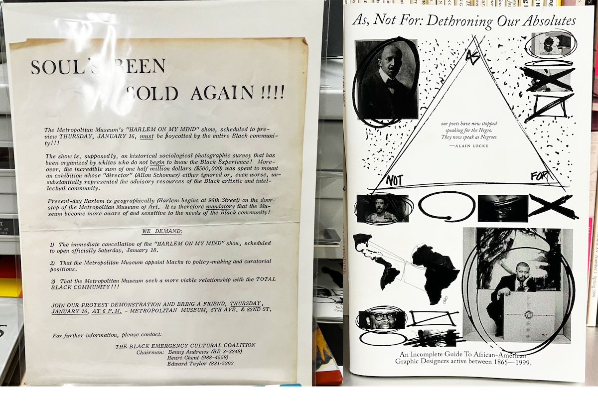
The Cheryl D. Miller Collection of Black Graphic Design History also highlights historical documents like this call to boycott the Met Museum’s exhibit “Harlem on My Mind” because of the institution’s lack of relationship-building, understanding, and sensitivity to the community (left), and As, Not for: Dethroning Our Absolutes, an Incomplete Guide to African-American Designers active between 1865-1999 (right). I’m already looking forward to returning to the Lubalin Center, especially to see how this collection grows.

The main reason I went to the Lubalin Center was to seek out inspiration, specifically for exploring this month’s theme of typography, but also, to reconnect with why I love design in the first place—the possibilities! The storytelling! The aesthetic pleasure! The delightful ‘damn, how’d they come up with that?!’ feeling! This month, I’ve been caught up in the grind of deadlines and bogged down by the robo-motions of churning things out. (It seems like we’re all trying to manage burnout, right?) I just wanted time to observe as a counterbalance to all the production. I also find that while I love following writers, designers, and artists on social media, I’m relating more to the commiseration content than the inspirational, and I need to take more substantial breaks from doomscrolling and staring at screens. So when Sasha shared his insights about digital visual culture, it really resonated with me. He explained why people (like me) seek this space out:
“I think what archives like this do is fight against the tide of digital visual culture and the conceptions that are pushed by algorithms. With algorithms, their main model is to make the things that are popular get to the end recipient. But graphic designers usually want to find things that are more unusual, and so they’re kind of working against the algorithms, which gets harder and harder to do. The archives like this have the opposite; they have the things that are lesser known, and that fits the way designers and creatives want to see things. They find more unusual things that they won’t be able to find online.
You don’t know what will resonate with you until you see that object. And the chances of discovering something unique here is infinitely huge, there’s an endless amount of discovery, even though the collection is a finite thing.”
After reflecting more on the experience over the weekend, I realized that I came away from the archives in a different headspace than from visiting a museum, which is my usual spark plug to jump start creative lulls. I wasn’t just an observer there—I was an explorer—diving into drawers, sifting through boxes, flipping pages. The tactile nature of these actions felt so satisfying and connected me more to the work, but also, to the ephemerality of the materials. Paperback books yellow with age, magazines warp, posters rip, flyers get tossed out as trash—it all degrades! Not all of these objects are one-of-a-kind artworks, but they still carry importance as visual markers of cultural history and should be valued and preserved as such. Being in that space ignited this child-like curiosity in me as I ferreted around, searching for buried treasure. With the curator’s guidance, I felt encouraged to pursue my curiosity and in doing so, crafted my own adventure. I left energized, wondering how I could replicate that feeling again in other spaces, in other projects—just a kid digging wildly through design.
Special thanks to Sasha Tochilovksy, Curator of The Herb Lubalin Study Center of Design and Typography. I had the best time!
To visit The Herb Lubalin Study Center at The Cooper Union, check out their website to make an appointment.
Thanks for reading.


The Herb Lubalin Study Center of Design is on my "to visit" list. Sounds so delightful! It seems there is so much to experience that several return visits will be needed.
Drooling. "Thank you for not discussing the outside world" is perfectly displayed in such a precious place. Thank you for the field trip!